Poster session schedule
Poster sessions will take place on 25 June (15:00 - 16:15) and 26 June (14:15 - 15:30).
Poster Presentation Details
- Printing and Setup: Poster presenters are responsible for printing and bringing their posters to the conference. Ensure that your posters are easily readable from a distance of 2-3 meters; this includes clear, legible text and suitably sized figures and photos. A good test is to view your poster full screen on a computer from a little distance to check readability and clarity.
- Interactive Screens: Presenters selected to use interactive screens will receive specific instructions via a separate email.
Poster presenters are responsible for printing and bringing their posters to the conference.
Poster presenters who are benefiting from an interactive screen to present their research will be informed in a separate email.
Poster prizes
Poster presenters who wish to be considered for the poster prize MUST UPLOAD THEIR POSTER BY 14 JUNE in the virtual poster gallery.
The Scientific Committee will make a first evaluation of the virtual posters and make the final decision on winners during the conference. Three prizes will be awarded during the closing remarks at the end of the SIB days.
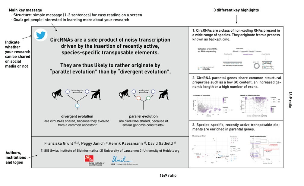
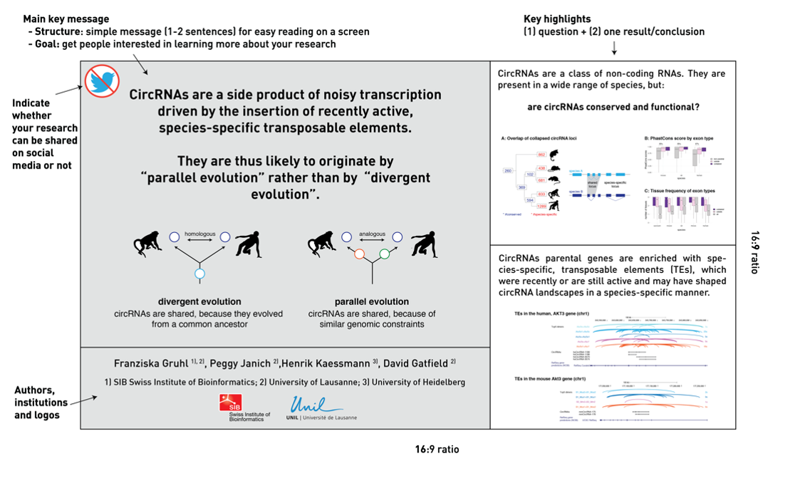
Structure
We encourage all poster presenters to prepare a simple graphical abstract of their poster based on Mike Morrison’s better poster ideas. You may choose vertical or horizontal format for both, the printed and the digital poster. Please note that the poster wall is 1.20 m (~47 inches) wide.
Printed poster
Participants will look at your poster from a distance of 2–3 m: the writing should be easily readable and the drawings, figures and photos not too small. A useful test is to sit in front of your computer screen (with a little distance) and to check whether you can read and understand all the text and figures when the image is shown full screen.
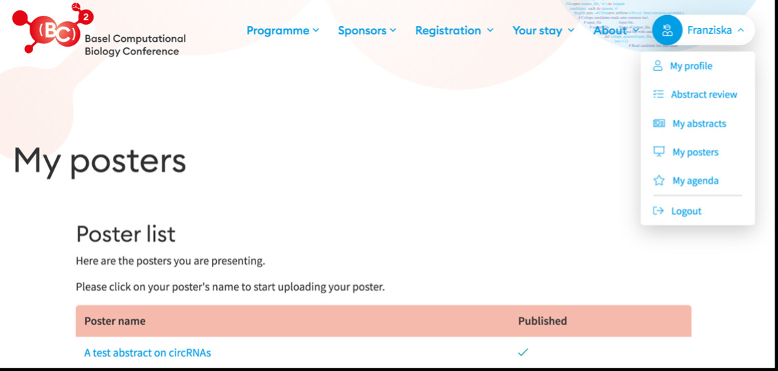
How to upload your digital poster ?
You must upload your poster in PDF format (50mb max): connect to the conference platform, go to "My posters" and follow the instructions.
On-site organization
All poster presenters should have received an email indicating the time and date of their poster presentation.
We will assign your poster a number to indicate where you have to hang it. You will find your number and the poster plan on our website in early June. Posters must be mounted in the morning of Tuesday 25 June before 12:00.
If you have any questions on the different formats or the organization, feel free to contact us at sibdays@sib.swiss!