1. Maintain a storyline
With a poster, you are presenting what you have done, why
and how you have conducted your analyses, what the results
are and how they fit with other findings in your research
field. Make sure that the text and the graphics on your
poster present a simple and cohesive story. In particular,
focus on one key research question from beginning to end,
rather than trying to cover everything you did.
2. Keep it simple and readable
-
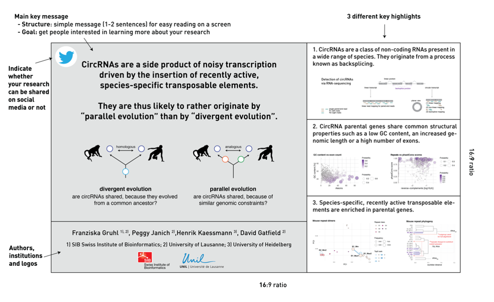
Left: main finding as one plain English sentence +
graphical abstract
- Right: 1 question + 1 result/conclusion

Layout 2
-
Left: main finding as one plain English sentence +
graphical abstract
- Right: up to three different highlights

3. When it comes to text, less is more
Convey as much of the information as possible in a
visually appealing way (e.g. diagrams, images, flow
charts) with limited text. A poster should be a visual
support to explain your research, not a copy-paste of
parts of a journal article. People will have only limited
time to read your poster.
If you need advice and inspiration about how to create a
great poster, we recommend the
#betterposter
scheme and blogspot [1-2].
4. Be colour-blind friendly
Avoid using colour combinations that will be difficult to
distinguish for people with colour blindness. This applies
both to poster backgrounds and diagrams and to microscopic
images. For more information, go to [3-5].
5. Acknowledge all authors and funding sources
Include the logo of the institution(s) you are affiliated
with, and other funding sources where applicable. There
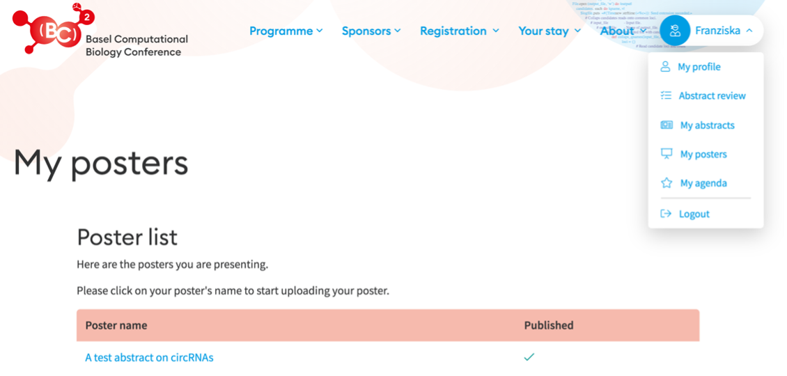
will be a comment box below your poster in the virtual
poster gallery (only visible to registered participants)
where you can put your email address as well as the
website of your group, so that people can contact you if
they want to know more about your work.
If you are an SIB Employee, you can use the poster
template on the
intranet.
Different formats of the SIB logo can be downloaded
from here.
6. Be aware of social media
If you do not wish for others to mention/share your work
on the social media, blogs, etc., put a ‘no Twitter’ icon
in the upper left corner of your poster.
References
[1]
https://www.youtube.com/watch?v=1RwJbhkCA58
[2]
http://betterposters.blogspot.com/
[3]
https://knightlab.northwestern.edu/2016/07/18/three-tools-to-help-you-make-colorblind-friendly-graphics/
[3]
https://venngage.com/blog/color-blind-friendly-palette/
[4]
https://www.colorbrewer2.org/


